More about machine learning: Machine Learning with Python
- Linear regression
- Logistic regression
- Decision trees
- Random forest
- Gradient boosting
- Machine learning with Python and Scikitlearn
- Neural Networks
- Principal Component Analysis (PCA)
- Clustering with python
- Anomaly detection with PCA
- Face Detection and Recognition
- Introduction to Graphs and Networks
Introduction
The term clustering refers to a wide range of techniques whose purpose is to find patterns or groups (clusters) within a set of observations. Partitions are established so that observations within the same group are similar to each other and different from observations in other groups. It is an unsupervised learning method, as the process does not take into account which group each observation actually belongs to (if such information exists). This characteristic is what differentiates clustering from classification methods, which do use the true classification during training.
Given the usefulness of clustering in very different disciplines (genomics, marketing...), many variants and adaptations of its methods and algorithms have been developed. Three main groups can be distinguished:
Partitioning Clustering: this type of algorithm requires the user to specify in advance the number of clusters to be created (K-means, K-medoids, CLARA).
Hierarchical Clustering: this type of algorithm does not require the user to specify in advance the number of clusters (agglomerative clustering, divisive clustering).
Methods that combine or modify the previous ones (hierarchical K-means, fuzzy clustering, model based clustering and density based clustering).
The Scikit Learn library contains Python implementations of the main clustering algorithms.
Distance Measures
All clustering methods have one thing in common: to carry out groupings, they need to define and quantify the similarity between observations. The term distance is used within the context of clustering as a quantification of the similarity or difference between observations. If observations are represented in a $p$-dimensional space, where $p$ is the number of variables associated with each observation, the more similar two observations are, the closer they will be, hence the term distance is used. The characteristic that makes clustering an adaptable method to very diverse scenarios is that it can use almost any type of distance, allowing the researcher to choose the most appropriate for the study in question. Below are some of the most commonly used.
Euclidean Distance
The Euclidean distance between two points $p$ and $q$ is defined as the length of the segment connecting both points. In Cartesian coordinates, the Euclidean distance is calculated using the Pythagorean theorem. For example, in a two-dimensional space where each point is defined by coordinates $(x,y)$, the Euclidean distance between $p$ and $q$ is:
$$d_{euc}(p,q) = \sqrt{(p_x - q_x)^2 + (p_y - q_y)^2}$$This equation can be generalized for an n-dimensional Euclidean space where each point is defined by a vector of n coordinates: $p = (p_1, p_2, p_3,...,p_n)$ and $q = (q_1, q_2, q_3,...,q_n)$.
$$d_{euc}(p,q) = \sqrt{(p_1 - q_1)^2 + (p_2 - q_2)^2 +...+(p_n - q_n)^2} =$$$$\sqrt{ \sum_{i=1}^n (p_i - q_i)^2}$$One way to give more weight to observations that are further apart is to use the squared Euclidean distance. In the case of clustering, where the goal is to group observations that minimize distance, this translates to a greater influence of observations that are more distant.
Manhattan Distance
The Manhattan distance, also known as taxicab metric, rectilinear distance or L1 distance, defines the distance between two points $p$ and $q$ as the sum of absolute differences between each dimension. This measure is less affected by outliers (it is more robust) than the Euclidean distance because it does not square the differences.
$$d_{man}(p,q) = \sum_{i=1}^n |(p_i - q_i)|$$The following image shows a comparison between the Euclidean distance (green segment) and the Manhattan distance (red, yellow and blue segments) in a two-dimensional space. There are multiple paths to connect two points with the same Manhattan distance, but only one with Euclidean distance.
Correlation
Correlation is a very useful distance measure when the definition of similarity is made in terms of pattern or shape rather than displacement or magnitude.
$$d_{cor}(p,q) = 1 - \text{correlation}(p,q)$$where the correlation can be of different types (Pearson, Spearman, Kendall...)
The following image shows the profile of 3 observations. a and b have exactly the same pattern, but b is shifted 4 units below a. Observation c has a different pattern from the others, but its value range is similar to that of b. According to Euclidean distance, observations b and c are the most similar since the sum of squared distances between their values is smaller. However, according to Pearson correlation, the most similar observations are a and b since they follow the same pattern.
This example shows that there is no single distance measure that is better than others, but rather it depends on the context in which it is used.
Jackknife Correlation
The Pearson correlation coefficient is effective as a similarity measure in many different fields. However, it has the disadvantage of not being robust to outliers, even if the normality condition is met. If two variables have a common peak or valley in a single observation, for example due to a reading error, the correlation will be dominated by this record despite the fact that there is no real correlation between the two variables. The same can occur in the opposite direction. If two variables are highly correlated except for one observation, in which the values are very disparate, then the existing correlation will be masked. One way to avoid this is to use Jackknife correlation, which consists of calculating all possible correlation coefficients between two variables if each observation is excluded in turn. The average of all Jackknife correlations attenuates to some extent the effect of the outlier.
$$\bar{\theta}_{(A,B)} = \text{Average Jackknife correlation (A,B)} = \frac{1}{n} \sum_{i=1}^n \hat r_i$$where $n$ is the number of observations and $\hat r_i$ is the correlation coefficient between variables $A$ and $B$, having excluded observation $i$.
In addition to the average, its standard error ($SE$) can be estimated and thus obtain confidence intervals for the Jackknife correlation and its corresponding p-value.
$$SE = \sqrt{\frac{n-1}{n} \sum_{i=1}^n (\hat r_i - \bar{\theta})^2}$$95% confidence interval $(Z=1.96)$
$$\text{Average Jackknife correlation (A,B)} \pm \ 1.96 *SE$$$$\bar{\theta} - 1.96 \sqrt{\frac{n-1}{n} \sum_{i=1}^n (\hat r_i - \bar{\theta})^2} \ , \ \ \bar{\theta}+ 1.96 \sqrt{\frac{n-1}{n} \sum_{i=1}^n (\hat r_i - \bar{\theta})^2}$$P-value for the null hypothesis that $\bar{\theta} = 0$:
$$Z_{calculated} = \frac{\bar{\theta} - H_0}{SE}= \frac{\bar{\theta} - 0}{\sqrt{\frac{n-1}{n} \sum_{i=1}^n (\hat r_i - \bar{\theta})^2}}$$$$p_{value} = P(Z > Z_{calculated})$$When using this method, it is convenient to calculate the difference between the correlation value obtained by Jackknife correlation $(\bar{\theta})$ and that obtained if all observations $(\bar{r})$ are used. This difference is known as Bias. Its magnitude is an indicator of how much the estimation of the correlation between two variables is influenced by an atypical value or outlier.
$$Bias = (n-1)*(\bar{\theta} - \hat{r})$$If the difference between each correlation $(\hat r_i)$ estimated in the Jackknife process and the correlation value $(\hat r)$ obtained if all observations are used is calculated, it is possible to identify which observations are more influential.
When the study requires minimizing the presence of false positives as much as possible, even though false negatives increase, the smallest of all those calculated in the Jackknife process can be selected as the correlation value.
$$\text{Correlation} = \text{min} \{ \hat r_1, \hat r_2,..., \hat r_n \}$$Despite the fact that the Jackknife method allows increasing the robustness of the Pearson correlation, if the outliers are very extreme their influence will still be notable.
Simple Matching Coefficient
When the variables with which similarity between observations is to be determined are of binary type, even though it is possible to encode them numerically as $1$ or $0$, it does not make sense to apply arithmetic operations on them (mean, sum...). For example, if the gender variable is encoded as $1$ for female and $0$ for male, it is meaningless to say that the mean of the gender variable in a given dataset is $0.5$. In situations like this, similarity measures based on Euclidean distance, Manhattan, correlation... cannot be used.
Given two observations A and B, each with $n$ binary attributes, the simple matching coefficient (SMC) defines the similarity between them as:
$$SMC= \frac{\text{number of matches}}{\text{total number of attributes}} = \frac{M_{00} + M_{11}}{M_{00} + M_{01}+ M_{10}+M_{11}}$$where $M_{00}$ and $M_{11}$ are the number of variables for which both observations have the same value (both $0$ or both $1$), and $M_{01}$ and $M_{10}$ the number of variables that do not match. The simple matching distance (SMD) value corresponds to $1 - SMC$.
Jaccard Index
The Jaccard index or Jaccard correlation coefficient is similar to the simple matching coefficient (SMC). The difference is that the SMC has the term $M_{00}$ in the numerator and denominator, while the Jaccard index does not. This means that SMC considers as matches both if the attribute is present in both sets and if the attribute is not in either set, while Jaccard only counts as matches when the attribute is present in both sets.
$$J= \frac{M_{11}}{M_{01}+ M_{10}+M_{11}}$$or in mathematical terms of sets:
$$J(A,B) = \frac{A \cap B}{A \cup B}$$The Jaccard distance ($1-J$) outperforms the simple matching distance in those situations where the coincidence of absence does not provide information. To illustrate this fact, suppose we want to quantify the similarity between two supermarket customers based on the items purchased. It is expected that each customer only acquires a few items from the many available, so the number of items not purchased by either ($M_{00}$) will be very high. Since the Jaccard distance ignores matches of type $M_{00}$, the degree of similarity will depend solely on matches between purchased items.
Cosine Distance
The cosine of the angle formed by two vectors can be interpreted as a measure of similarity of their orientations, regardless of their magnitudes. If two vectors have exactly the same orientation (the angle they form is 0º) their cosine takes the value of 1, if they are perpendicular (they form an angle of 90º) their cosine is 0, and if they have opposite orientations (180º angle) their cosine is -1.
$$\text{cos}(\alpha) = \frac{\textbf{x} \cdot \textbf{y}}{||\textbf{x}|| \ ||\textbf{y}||}$$If the vectors are normalized by subtracting the mean ($X − \bar{X}$), the measure is called centered cosine and is equivalent to Pearson correlation.
Variable Scaling
The scale in which variables are measured and the magnitude of their variance can affect the results obtained by clustering. If one variable has a much larger scale than the others, it will largely determine the distance/similarity value obtained when comparing observations, thus directing the final grouping. Scaling and centering variables before calculating the distance matrix so that they have mean 0 and standard deviation 1, ensures that all variables have the same weight when performing clustering. Sebastian Raschka provides a very explanatory analysis of the different types of scaling and normalization.
The most commonly used way to scale and center variables is:
$$\frac{x_i - mean(x)}{sd(x)}$$Applying this transformation, there is a relationship between Euclidean distance and Pearson correlation that makes the results obtained by clustering equivalent.
$$d_{euclidean}(p,q\ standardized) = \sqrt{2n(1-cor(p,q))}$$Example: Distance Calculation
The USArrests dataset contains the percentage of assaults (Assault), murders (Murder) and kidnappings (Rape) per 100,000 inhabitants for each of the 50 states of the USA (1973). In addition, it also includes the percentage of each state's population living in rural areas (UrbanPoP). Using these variables, the goal is to calculate a distance matrix that allows identifying the most similar states.
Two of the Python libraries that implement the distances described in this document (along with others) are sklearn.metrics.pairwise_distances and scipy.spatial.distance. Specifically, sklearn allows calculating the distances: 'cityblock', 'cosine', 'euclidean', 'l1', 'l2', 'manhattan', 'braycurtis', 'canberra', 'chebyshev', 'correlation', 'dice', 'hamming', 'jaccard', 'kulsinski', 'mahalanobis', 'minkowski', 'rogerstanimoto', 'russellrao', 'seuclidean', 'sokalmichener', 'sokalsneath', 'sqeuclidean' and 'yule'.
Libraries
The libraries used in this example are:
# Data processing
# ==============================================================================
import numpy as np
import pandas as pd
import statsmodels.api as sm
# Graphics
# ==============================================================================
import matplotlib.pyplot as plt
plt.style.use('ggplot')
# Preprocessing and modeling
# ==============================================================================
from sklearn.metrics import pairwise_distances
from sklearn.preprocessing import StandardScaler
# Warning configuration
# ==============================================================================
import warnings
warnings.filterwarnings('once')
Data
USArrests = sm.datasets.get_rdataset("USArrests", "datasets")
data = USArrests.data
data = data.rename_axis(None, axis=0)
data.head(4)
| Murder | Assault | UrbanPop | Rape | |
|---|---|---|---|---|
| Alabama | 13.2 | 236 | 58 | 21.2 |
| Alaska | 10.0 | 263 | 48 | 44.5 |
| Arizona | 8.1 | 294 | 80 | 31.0 |
| Arkansas | 8.8 | 190 | 50 | 19.5 |
Distance Calculation
# Variable scaling
# ==============================================================================
scaler = StandardScaler().set_output(transform="pandas")
data_scaled = scaler.fit_transform(data)
data_scaled.head(4)
| Murder | Assault | UrbanPop | Rape | |
|---|---|---|---|---|
| Alabama | 1.255179 | 0.790787 | -0.526195 | -0.003451 |
| Alaska | 0.513019 | 1.118060 | -1.224067 | 2.509424 |
| Arizona | 0.072361 | 1.493817 | 1.009122 | 1.053466 |
| Arkansas | 0.234708 | 0.233212 | -1.084492 | -0.186794 |
# Distance calculation
# ==============================================================================
print('------------------')
print('Euclidean distance')
print('------------------')
distances = pairwise_distances(
X = data_scaled,
metric ='euclidean'
)
# Discard the upper diagonal of the matrix
distances[np.triu_indices(n=distances.shape[0])] = np.nan
distances = pd.DataFrame(
distances,
columns=data_scaled.index,
index = data_scaled.index
)
distances.iloc[:4,:4]
------------------ Euclidean distance ------------------
| Alabama | Alaska | Arizona | Arkansas | |
|---|---|---|---|---|
| Alabama | NaN | NaN | NaN | NaN |
| Alaska | 2.731204 | NaN | NaN | NaN |
| Arizona | 2.316805 | 2.728061 | NaN | NaN |
| Arkansas | 1.302905 | 2.854730 | 2.74535 | NaN |
The distance matrix is restructured to be able to sort observation pairs by distance order.
# Top n most similar observations
# ==============================================================================
(
distances.melt(ignore_index=False, var_name="state_b", value_name='distance')
.rename_axis("state_a")
.reset_index()
.dropna() \
.sort_values('distance')
.head(3)
)
| state_a | state_b | distance | |
|---|---|---|---|
| 728 | New Hampshire | Iowa | 0.207944 |
| 631 | New York | Illinois | 0.353774 |
| 665 | Kansas | Indiana | 0.433124 |
# States with maximum and minimum distance
# ==============================================================================
fig, axs = plt.subplots(1,2, figsize=(8, 3.5))
data.loc[['Vermont', 'Florida']].transpose().plot(ax= axs[0])
axs[0].set_title('States with maximum distance')
data.loc[['New Hampshire', 'Iowa']].transpose().plot(ax= axs[1])
axs[1].set_title('States with minimum distance')
plt.tight_layout();

Optimal Number of Clusters
Determining the optimal number of clusters is one of the most complicated steps when applying clustering methods, especially when it comes to partitioning clustering, where the number must be specified before being able to see the results. There is no single way to find the appropriate number of clusters. It is a fairly subjective process that depends largely on the algorithm used and on whether prior information about the data being worked with is available. Despite this, several strategies have been developed that help in the process.
Elbow Method
The Elbow method, also known as the elbow method, follows a strategy commonly used to find the optimal value of a hyperparameter. The idea is to test a range of values of the hyperparameter in question, graphically represent the results obtained with each one, and identify that point on the curve (elbow) from which the improvement ceases to be notable. In cases of partitioning clustering, such as K-means, observations are grouped in a way that minimizes the total intra-cluster variance. The Elbow method calculates the total intra-cluster variance as a function of the number of clusters and chooses as optimal that value from which adding more clusters barely achieves improvement.
Average Silhouette Method
The average silhouette method considers the optimal number of clusters to be the one that maximizes the average of the silhouette coefficient of all observations.
The silhouette coefficient $(s_i)$ quantifies how good the assignment of an observation has been by comparing its similarity with the rest of the observations in its cluster versus those in other clusters. Its value can be between -1 and 1, with values close to 1 being an indication that the observation has been assigned to the correct cluster.
For each observation $i$, the silhouette coefficient $(s_i)$ is obtained as follows:
Calculate the average distance (call it $a_i$) between observation $i$ and the rest of the observations that belong to the same cluster. The smaller $a_i$ is, the better the assignment of $i$ to its cluster has been.
Calculate the average distance between observation $i$ and the rest of the clusters. Understanding average distance between $i$ and a given cluster $C$ as the mean of the distances between $i$ and the observations of cluster $C$.
Identify as $b_i$ the smallest of the average distances between $i$ and the rest of the clusters, that is, the distance to the nearest cluster (neighbouring cluster).
Calculate the silhouette value as:
The optimal number of clusters is considered to be the one that maximizes the average of the silhouette coefficient of all observations.
Gap Statistic
The gap statistic was published by R.Tibshirani, G.Walther and T. Hastie, also authors of the magnificent book Introduction to Statistical Learning. This statistic compares, for different values of k, the observed total intra-cluster variance versus the expected value according to a uniform reference distribution. The estimation of the optimal number of clusters is the value k with which the gap statistic is maximized, that is, it finds the value of k with which a cluster structure as far as possible from a random uniform distribution is achieved. This method can be applied to any type of clustering.
The algorithm of the gap statistic method is as follows:
Perform clustering of the data for a range of values of $k$ ($k=1$, ..., $K=n$) and calculate for each one the value of the total intra-cluster variance ($W_k$).
Simulate $B$ reference datasets, all of them with a uniform random distribution. Apply clustering to each of the sets with the same range of values $k$ used in the original data, and calculating in each case the total intra-cluster variance ($W_{kb}$). It is recommended to use values of $B=500$.
Calculate the gap statistic for each value of $k$ as the deviation of the observed variance $W_k$ from the expected value according to the reference distribution ($W_{kb}$). Also calculate its standard deviation.
- Identify the optimal number of clusters as the smallest of the values $k$ for which the gap statistic is less than one standard deviation away from the gap value of the next $k$: $gap(k) \geq gap(k+1) - s_{k+1}$.
The Elbow, Silhouette and gap methods do not necessarily have to coincide exactly in their estimation of the optimal number of clusters, but they tend to narrow down the range of possible values. For this reason it is advisable to calculate all three and based on the results decide.
K-means
The K-means algorithm (MacQueen, 1967) groups observations into a predefined number of K clusters in such a way that the sum of the internal variances of the clusters is as small as possible.
There are several implementations of this algorithm, the most common of which is known as Lloyd's. In the literature it is common to find the terms inertia, within-cluster sum-of-squares or intra-cluster variance to refer to the internal variance of clusters.
Algorithm
Consider $C_1$,..., $C_K$ as the sets formed by the indices of the observations of each of the clusters. For example, set $C_1$ contains the indices of the observations grouped in cluster 1. The nomenclature used to indicate that observation $i$ belongs to cluster $k$ is: $i \in C_k$. All sets satisfy two properties:
$C_1 \cup C_2 \cup ... \cup C_K = \{1,...,n\}$. Means that every observation belongs to one of the K clusters.
$C_k \cap C_{k'} = \emptyset$ for all $k \neq k'$. Implies that clusters do not overlap, no observation belongs to more than one cluster at a time.
Two measures commonly used to quantify the internal variance of a cluster ($W(C_k)$) are:
- The sum of squared Euclidean distances between each observation ($x_i$) and the centroid ($\mu$) of its cluster. This is equivalent to the sum of internal squares of the cluster and is the metric used by scikit-learn.
- The sum of squared Euclidean distances between all pairs of observations that form the cluster, divided by the number of observations in the cluster.
Minimizing the total sum of internal variance $\sum^k_{k=1}W(C_k)$ exactly (finding the global minimum) is a very complex process due to the immense number of ways in which n observations can be distributed among K groups. Instead, k-means tries to find a solution that, even if it is not the best of all possible, is good (local optimum). The algorithm used is:
Specify the number K of clusters to be created.
Randomly select k observations from the dataset as initial centroids.
Assign each observation to the nearest centroid.
For each of the K clusters generated in step 3, recalculate its centroid.
Repeat steps 3 and 4 until the assignments do not change or the established maximum number of iterations is reached.
This algorithm guarantees that, at each step, the total intra-variance of clusters is reduced until a local optimum is reached. Because the K-means algorithm does not evaluate all possible distributions of observations but only part of them, the results obtained depend on the initial random assignment (step 2). For this reason, it is important to run the algorithm several times (25-50), each with a different initial random assignment, and select the one that achieved the lowest total variance.
Advantages and Disadvantages
K-means is one of the most widely used clustering methods. It stands out for the simplicity and speed of its algorithm, however, it has a series of limitations that must be taken into account.
It requires that the number of clusters to be created be indicated in advance. This can be complicated if additional information about the data being worked with is not available. Several strategies have been developed to help identify potential optimal values of K (elbow, silhouette), but all of them are indicative.
Difficulty detecting elongated clusters or those with irregular shapes.
The resulting groupings can vary depending on the initial random assignment of centroids. To minimize this problem, it is recommended to repeat the clustering process between 25-50 times and select as the definitive result the one with the lowest total sum of internal variance. Even so, the reproducibility of results can only be guaranteed if seeds are used.
It presents robustness problems in the face of outliers. The only solution is to exclude them or resort to more robust clustering methods such as K-medoids (PAM).
Example
The following simulated data contains observations that belong to four different groups. The goal is to apply K-means-clustering to identify the real groupings.
Libraries
The libraries used in this example are:
# Data processing
# ==============================================================================
import numpy as np
import pandas as pd
from sklearn.datasets import make_blobs
# Graphics
# ==============================================================================
import matplotlib.pyplot as plt
plt.style.use('ggplot')
# Preprocessing and modeling
# ==============================================================================
from sklearn.cluster import KMeans
from sklearn.preprocessing import StandardScaler
from sklearn.metrics import silhouette_score
# Warning configuration
# ==============================================================================
import warnings
warnings.filterwarnings('once')
Data
# Data simulation
# ==============================================================================
X, y = make_blobs(
n_samples = 300,
n_features = 2,
centers = 4,
cluster_std = 0.60,
shuffle = True,
random_state = 0
)
fig, ax = plt.subplots(1, 1, figsize=(6, 3.5))
ax.scatter(
x = X[:, 0],
y = X[:, 1],
c = 'white',
marker = 'o',
edgecolor = 'black',
)
ax.set_title('Simulated data');

Kmeans Model
With the sklearn.cluster.KMeans class from Scikit-Learn, clustering models can be trained using the k-means algorithm. Among its parameters are:
n_clusters: determines the number $K$ of clusters to be generated.init: strategy for assigning initial centroids. By default 'k-means++' is used, a strategy that tries to distance centroids as much as possible facilitating convergence. However, this strategy can slow down the process when there is a lot of data, if this occurs, it is better to use 'random'.n_init: determines the number of times the process will be repeated, each time with a different initial random assignment. It is recommended that this last value be high, between 10-25, to avoid obtaining suboptimal results due to an unfortunate initiation of the process.max_iter: maximum number of iterations allowed.random_state: seed to guarantee reproducibility of results.
# Data scaling
# ==============================================================================
scaler = StandardScaler()
X_scaled = scaler.fit_transform(X)
# Model
# ======================================================================
kmeans_model = KMeans(n_clusters=4, n_init=25, random_state=123)
kmeans_model.fit(X=X_scaled)
KMeans(n_clusters=4, n_init=25, random_state=123)In a Jupyter environment, please rerun this cell to show the HTML representation or trust the notebook.
On GitHub, the HTML representation is unable to render, please try loading this page with nbviewer.org.
Parameters
| n_clusters | 4 | |
| init | 'k-means++' | |
| n_init | 25 | |
| max_iter | 300 | |
| tol | 0.0001 | |
| verbose | 0 | |
| random_state | 123 | |
| copy_x | True | |
| algorithm | 'lloyd' |
The object returned by KMeans() contains, among other data: the mean of each of the variables for each cluster (cluster_centers_), that is, the centroids. A vector indicating to which cluster each observation has been assigned (.labels_) and the total sum of internal squares of all clusters (.inertia_).
Number of Clusters
Since this is a simulation, the true number of groups (4) and which group each observation belongs to are known. This does not happen in most practical cases, but it is useful as an illustrative example of how K-means works.
# Classification with the kmeans model
# ======================================================================
y_pred = kmeans_model.predict(X=X_scaled)
# Graphical representation: original groups vs created clusters
# ======================================================================
fig, ax = plt.subplots(1, 2, figsize=(9, 4), sharey=True)
# Original groups
for i in np.unique(y):
ax[0].scatter(
x = X_scaled[y == i, 0],
y = X_scaled[y == i, 1],
c = plt.rcParams['axes.prop_cycle'].by_key()['color'][i],
marker = 'o',
edgecolor = 'black',
label = f"Group {i}"
)
ax[0].set_title('Original groups')
ax[0].legend()
for i in np.unique(y_pred):
ax[1].scatter(
x = X_scaled[y_pred == i, 0],
y = X_scaled[y_pred == i, 1],
c = plt.rcParams['axes.prop_cycle'].by_key()['color'][i],
marker = 'o',
edgecolor = 'black',
label = f"Cluster {i}"
)
ax[1].scatter(
x = kmeans_model.cluster_centers_[:, 0],
y = kmeans_model.cluster_centers_[:, 1],
c = 'black',
s = 200,
marker = '*',
label = 'centroids'
)
ax[1].set_title('Clusters generated by Kmeans')
ax[1].legend()
plt.tight_layout();

This type of visualization is very useful and informative, however, it is only possible when working with two dimensions. If the data contains more than two variables (dimensions), a possible solution is to use the first two principal components obtained with a prior PCA.
The number of hits and errors can be represented as a confusion matrix. When interpreting these matrices, it is important to remember that clustering assigns observations to clusters whose identifier does not have to coincide with the nomenclature used for the real groups. In this example, group 1 has been assigned to cluster 3. Thus, for each row of the matrix one can expect a high value (matches) for one of the positions and low values in the others (classification errors), but the names (diagonal) do not have to coincide.
# Confusion matrix: original groups vs created clusters
# ======================================================================
pd.crosstab(y, y_pred, dropna=False, rownames=['real_group'], colnames=['cluster'])
| cluster | 0 | 1 | 2 | 3 |
|---|---|---|---|---|
| real_group | ||||
| 0 | 75 | 0 | 0 | 0 |
| 1 | 0 | 0 | 0 | 75 |
| 2 | 0 | 75 | 0 | 0 |
| 3 | 0 | 0 | 75 | 0 |
In this analysis, all observations have been classified correctly. Again, note that in reality, the true groups into which observations are divided are not usually known, otherwise there would be no need to apply clustering.
Now suppose this is a real case, in which the number of groups into which observations are subdivided is unknown. The analyst would have to try different values of $K$ and decide which seems more reasonable. Below are the results for $K=2$ and $K=6$.
# Results for K = 2
# ==============================================================================
fig, ax = plt.subplots(1, 2, figsize=(9, 4), sharey=True)
y_pred = KMeans(n_clusters=2, n_init=25, random_state=123).fit_predict(X=X_scaled)
ax[0].scatter(
x = X_scaled[:, 0],
y = X_scaled[:, 1],
c = y_pred,
marker = 'o',
edgecolor = 'black'
)
ax[0].set_title('KMeans K=2');
# Results for K = 6
# ==============================================================================
y_pred = KMeans(n_clusters=6, n_init=25, random_state=123).fit_predict(X=X_scaled)
ax[1].scatter(
x = X_scaled[:, 0],
y = X_scaled[:, 1],
c = y_pred,
marker = 'o',
edgecolor = 'black'
)
ax[1].set_title('KMeans K=6')
plt.tight_layout();

When observing the results obtained for K = 2, it is intuitive to think that the group found around coordinates $x = 0.5, y = 0$ (mostly considered as yellow) should be a separate group. For K = 6 the separation of the yellow and blue groups does not seem very reasonable. This example shows the main limitation of the K-means method, the fact of having to choose in advance the number of clusters to be generated.
The previous deduction can only be made visually when dealing with two dimensions. A simple way to estimate the optimal number K of clusters when this information is not available, is to apply the K-means algorithm for a range of values of K and identify the value from which the reduction in the total sum of intra-cluster variance (inertia) ceases to be substantial. This strategy is known as the elbow method or elbow method.
# Elbow method to identify optimal number of clusters
# ======================================================================
range_n_clusters = range(1, 15)
inertias = []
for n_clusters in range_n_clusters:
kmeans_model = KMeans(
n_clusters = n_clusters,
n_init = 20,
random_state = 123
)
kmeans_model.fit(X_scaled)
inertias.append(kmeans_model.inertia_)
fig, ax = plt.subplots(1, 1, figsize=(6, 3.5))
ax.plot(range_n_clusters, inertias, marker='o')
ax.set_title("Evolution of total intra-cluster variance")
ax.set_xlabel('Number of clusters')
ax.set_ylabel('Intra-cluster (inertia)');

From 4 clusters onwards, the reduction in the total sum of internal squares seems to stabilize, indicating that K = 4 is a good choice.
# Silhouette method to identify optimal number of clusters
# ======================================================================
range_n_clusters = range(2, 15)
avg_silhouette_values = []
for n_clusters in range_n_clusters:
kmeans_model = KMeans(
n_clusters = n_clusters,
n_init = 20,
random_state = 123
)
cluster_labels = kmeans_model.fit_predict(X_scaled)
silhouette_avg = silhouette_score(X_scaled, cluster_labels)
avg_silhouette_values.append(silhouette_avg)
fig, ax = plt.subplots(1, 1, figsize=(6, 3.5))
ax.plot(range_n_clusters, avg_silhouette_values, marker='o')
ax.set_title("Evolution of average silhouette indices")
ax.set_xlabel('Number of clusters')
ax.set_ylabel('Average silhouette indices');

The average value of the silhouette indices is maximized with 4 clusters. According to this criterion, K = 4 is the best option.
Both criteria, elbow and silhouette, identify the value K=4 as the optimal value of clusters.
K-medoids
Algorithm
K-medoids is a clustering method very similar to K-means in that both group observations into K clusters, where K is a value pre-established by the analyst. The difference is that, in K-medoids, each cluster is represented by an observation present in the cluster (medoid), while in K-means each cluster is represented by its centroid, which corresponds to the average of all observations in the cluster but with none in particular.
A more exact definition of the term medoid is: element within a cluster whose average distance (difference) between it and all other elements of the same cluster is as small as possible. It corresponds to the most central element of the cluster and therefore can be considered as the most representative. The fact of using medoids instead of centroids makes K-medoids a more robust method than K-means, being less affected by outliers or noise. As an intuitive idea it can be considered as the analogy between mean and median.
The most commonly used algorithm to apply K-medoids is known as PAM (Partitioning Around Medoids) and follows these steps:
Select K random observations as initial medoids. It is also possible to identify them specifically.
Calculate the distance matrix between all observations if this has not been calculated previously.
Assign each observation to its nearest medoid.
For each of the clusters created, check if selecting another observation as medoid achieves a reduction in the average distance of the cluster, if this occurs, select the observation that achieves a greater reduction as the new medoid.
If at least one medoid has changed in step 4, return to step 3, otherwise, the process ends.
Unlike the K-means algorithm, in which the total sum of intra-cluster squares is minimized (sum of squared distances of each observation with respect to its centroid), the K-medoids algorithm minimizes the sum of the differences of each observation with respect to its medoid.
In general, the K-medoids method is used when the presence of outliers is known or suspected. If this occurs, it is advisable to use the Manhattan distance as a similarity measure, since it is less sensitive to outliers than the Euclidean.
Advantages and Disadvantages
K-medoids is a more robust clustering method than K-means, so it is more suitable when the dataset contains outliers or noise.
Like K-means, it needs the number of clusters to be created to be specified in advance. This can be complicated to determine if additional information about the data is not available. Many of the strategies used in K-means to identify the optimal number can be applied in K-medoids.
For large datasets many computational resources are needed. In such a situation it is recommended to apply the CLARA method.
The K-medoids algorithm is implemented in the KMedoids class of the sklearn_extra library. Its operation is analogous to that described in the K-means section. It is also available in the PyClustering library.
Hierarchical Clustering
Hierarchical clustering is an alternative to partitioning clustering methods that does not require the number of clusters to be pre-specified. The methods encompassed by hierarchical clustering are subdivided into two types depending on the strategy followed to create the groups:
Agglomerative (agglomerative clustering or bottom-up): grouping starts with all observations separated, each forming an individual cluster. The clusters are combined as the structure grows until they converge into one.
Divisive (divisive clustering or top-down): it is the opposite strategy to agglomerative. It starts with all observations contained in the same cluster and divisions occur until each observation forms an individual cluster.
In both cases, the results can be represented very intuitively in a tree structure called a dendrogram.
Agglomerative
The algorithm followed by agglomerative clustering is:
Consider each of the n observations as an individual cluster, thus forming the base of the dendrogram (leaves).
Iterative process until all observations belong to a single cluster:
2.1 Calculate the distance between each possible pair of the n clusters. The researcher must determine the type of measure used to quantify the similarity between observations or groups (distance and linkage).
2.2 The two most similar clusters are merged, resulting in n-1 clusters.
Cut the generated tree structure (dendrogram) at a certain height to create the final clusters.
For the grouping process to be carried out as indicated by the previous algorithm, it is necessary to define how the similarity between two clusters is quantified. That is, the concept of distance between pairs of observations must be extended so that it is applicable to pairs of groups, each formed by several observations. This process is known as linkage. Below are the 5 most commonly used types of linkage and their definitions.
Complete or Maximum: the distance between all possible pairs formed by an observation from cluster A and one from cluster B is calculated. The largest of all of them is selected as the distance between the two clusters. This is the most conservative measure (maximal intercluster dissimilarity).
Single or Minimum: the distance between all possible pairs formed by an observation from cluster A and one from cluster B is calculated. The smallest of all of them is selected as the distance between the two clusters. This is the least conservative measure (minimal intercluster dissimilarity).
Average: The distance between all possible pairs formed by an observation from cluster A and one from cluster B is calculated. The average value of all of them is selected as the distance between the two clusters (mean intercluster dissimilarity).
Centroid: The centroid of each of the clusters is calculated and the distance between them is selected as the distance between the two clusters.
Ward: This is a general method. The selection of the pair of clusters that are combined in each step of agglomerative hierarchical clustering is based on the optimal value of an objective function, which can be any function defined by the analyst. Ward's minimum variance method is a particular case in which the objective is to minimize the total sum of intra-cluster variance. At each step, those 2 clusters whose fusion leads to the smallest increase in total intra-cluster variance are identified. This is the same metric that is minimized in K-means.
The methods of complete, average, and Ward's minimum variance are usually preferred by analysts because they generate more balanced dendrograms. However, one cannot be determined to be better than another, as it depends on the case study in question. For example, in genomics, the centroid method is frequently used. Along with the results of a hierarchical clustering process, it is always necessary to indicate which distance has been used, as well as the type of linkage, since, depending on these, the results can vary greatly.
Divisive
The best-known algorithm for divisive hierarchical clustering is DIANA (DIvisive ANAlysis Clustering). This algorithm starts with a single cluster containing all observations. Then, divisions occur until each observation forms an independent cluster. In each iteration, the cluster with the largest diameter is selected, understanding by diameter of a cluster the largest of the differences between two of its observations. Once the cluster is selected, the most disparate observation is identified, which is the one with the greatest average distance with respect to the rest of the observations that form the cluster. This observation initiates the new cluster. Observations are reassigned depending on whether they are closer to the new cluster or to the rest of the partition, thus dividing the selected cluster into two new clusters.
All n observations form a single cluster.
Repeat until there are n clusters:
2.1 Calculate for each cluster the largest of the distances between pairs of observations (diameter of the cluster).
2.2 Select the cluster with the largest diameter.
2.3 Calculate the average distance of each observation with respect to the others.
2.4 The most distant observation initiates a new cluster.
2.5 The remaining observations are reassigned to the new cluster or the old one depending on which is closer.
Unlike agglomerative clustering, where a type of distance and a linkage method must be chosen, in divisive clustering only the distance must be chosen, there is no linkage.
Dendrogram
The results of hierarchical clustering can be represented as a tree in which the branches represent the hierarchy with which the cluster unions occur.
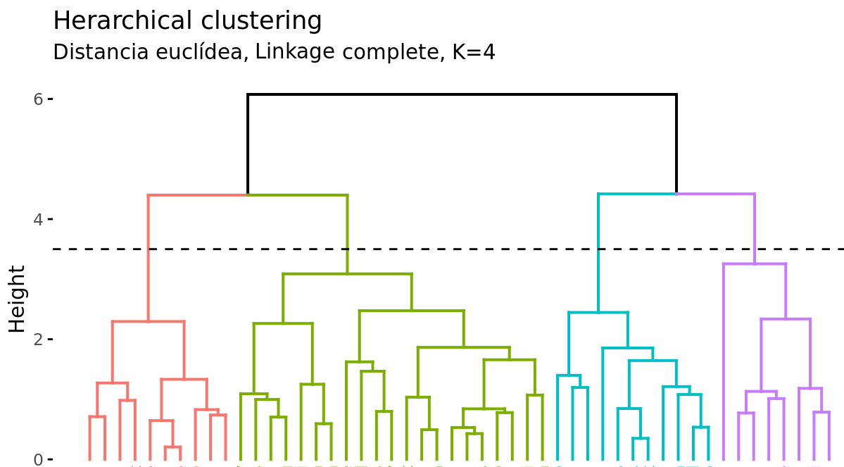
Suppose there are 45 observations in a two-dimensional space, to which hierarchical clustering is applied to try to identify groups. The following dendrogram represents the results obtained.
At the base of the dendrogram, each observation forms an individual termination known as a leaf of the tree. As one ascends the structure, pairs of leaves merge forming the first branches. These unions correspond to the most similar pairs of observations. It also happens that branches merge with other branches or with leaves. The earlier (closer to the base of the dendrogram) a fusion occurs, the greater the similarity.
For any pair of observations, the point in the tree where the branches containing said observations merge can be identified. The height at which this occurs (vertical axis) indicates how similar/different the two observations are. Dendrograms, therefore, should be interpreted solely based on the vertical axis and not by the positions that the observations occupy on the horizontal axis, the latter is simply for aesthetics and can vary from one program to another.
For example, observation 8 is the most similar to 10 since it is the first fusion that observation 10 receives (and vice versa). It might be tempting to say that observation 14, located immediately to the right of 10, is the next most similar, however, observations 28 and 44 are more similar to 10 even though they are further away on the horizontal axis. Similarly, it is not correct to say that observation 14 is more similar to observation 10 than 36 is because it is closer on the horizontal axis. Paying attention to the height at which the respective branches join, the only valid conclusion is that the similarity between pairs 10-14 and 10-36 is the same.
Cutting the Dendrogram to Generate Clusters
In addition to representing the similarity between observations in a dendrogram, the number of clusters created and which observations are part of each one must be identified. If a horizontal cut is made at a certain height of the dendrogram, the number of branches that exceed (in ascending sense) said cut corresponds to the number of clusters. The following image shows the same dendrogram twice. If the cut is made at a height of 5, two clusters are obtained, while if it is made at 3.5, 4 are obtained. The cutting height therefore has the same function as the K value in K-means-clustering: it controls the number of clusters obtained.
Two additional properties are derived from the way clusters are generated in the hierarchical clustering method:
Given the variable length of the branches, there is always a height interval for which any cut results in the same number of clusters. In the previous example, all cuts between heights 5 and 6 result in the same 2 clusters.
With a single dendrogram, there is flexibility to generate any number of clusters from 1 to n. The selection of the optimal number can be assessed visually, trying to identify the main branches based on the height at which the unions occur. In the example shown it is reasonable to choose between 2 or 4 clusters.
Example
The following simulated data contain observations that belong to four different groups. The goal is to apply agglomerative hierarchical clustering with the objective of identifying the real groupings.
Libraries
The libraries used in this example are:
# Data processing
# ==============================================================================
import numpy as np
import pandas as pd
from sklearn.datasets import make_blobs
# Graphics
# ==============================================================================
import matplotlib.pyplot as plt
plt.style.use('ggplot')
# Preprocessing and modeling
# ==============================================================================
from sklearn.cluster import AgglomerativeClustering
from scipy.cluster.hierarchy import dendrogram
def plot_dendrogram(model, **kwargs):
'''
This function extracts information from an AgglomerativeClustering model
and represents its dendrogram with the dendrogram function from scipy.cluster.hierarchy
'''
counts = np.zeros(model.children_.shape[0])
n_samples = len(model.labels_)
for i, merge in enumerate(model.children_):
current_count = 0
for child_idx in merge:
if child_idx < n_samples:
current_count += 1 # leaf node
else:
current_count += counts[child_idx - n_samples]
counts[i] = current_count
linkage_matrix = np.column_stack([model.children_, model.distances_,
counts]).astype(float)
dendrogram(linkage_matrix, **kwargs)
Data
# Data simulation
# ==============================================================================
X, y = make_blobs(
n_samples = 200,
n_features = 2,
centers = 4,
cluster_std = 0.60,
shuffle = True,
random_state = 0
)
fig, ax = plt.subplots(1, 1, figsize=(6, 3.5))
for i in np.unique(y):
ax.scatter(
x = X[y == i, 0],
y = X[y == i, 1],
c = plt.rcParams['axes.prop_cycle'].by_key()['color'][i],
marker = 'o',
edgecolor = 'black',
label = f"Group {i}"
)
ax.set_title('Simulated data')
ax.legend();

Model
With the sklearn.cluster.AgglomerativeClustering class from Scikit-Learn, clustering models can be trained using the agglomerative hierarchical clustering algorithm. Among its parameters are:
n_clusters: determines the number of clusters to be generated. Instead, its value can beNoneif you want to use thedistance_thresholdcriterion to create the clusters or grow the entire dendrogram.distance_threshold: distance (height of the dendrogram) from which clusters stop merging. Indicatedistance_threshold=0to grow the entire tree.compute_full_tree: whether the complete hierarchy of clusters is calculated. It must beTrueifdistance_thresholdis different fromNone.metric: metric used as distance. It can be: "euclidean", "l1", "l2", "manhattan", "cosine", or "precomputed". Iflinkage="ward"is used, only "euclidean" is allowed.linkage: type of linkage used. It can be "ward", "complete", "average", or "single".
When applying agglomerative hierarchical clustering, a distance measure and a type of linkage must be chosen. Below, the results are compared with the complete, ward, and average linkages, using the Euclidean distance as a similarity metric.
# Data scaling
# ==============================================================================
scaler = StandardScaler()
X_scaled = scaler.fit_transform(X)
# Models
# ======================================================================
hclust_complete_model = AgglomerativeClustering(
metric = 'euclidean',
linkage = 'complete',
distance_threshold = 0,
n_clusters = None
)
hclust_complete_model.fit(X=X_scaled)
hclust_average_model = AgglomerativeClustering(
metric = 'euclidean',
linkage = 'average',
distance_threshold = 0,
n_clusters = None
)
hclust_average_model.fit(X=X_scaled)
hclust_ward_model = AgglomerativeClustering(
metric = 'euclidean',
linkage = 'ward',
distance_threshold = 0,
n_clusters = None
)
hclust_ward_model.fit(X=X_scaled)
AgglomerativeClustering(distance_threshold=0, n_clusters=None)In a Jupyter environment, please rerun this cell to show the HTML representation or trust the notebook.
On GitHub, the HTML representation is unable to render, please try loading this page with nbviewer.org.
Parameters
| n_clusters | None | |
| metric | 'euclidean' | |
| memory | None | |
| connectivity | None | |
| compute_full_tree | 'auto' | |
| linkage | 'ward' | |
| distance_threshold | 0 | |
| compute_distances | False |
# Dendrograms
# ======================================================================
fig, axs = plt.subplots(3, 1, figsize=(8, 8))
plot_dendrogram(hclust_average_model, color_threshold=0, ax=axs[0])
axs[0].set_title("Euclidean distance, Linkage average")
plot_dendrogram(hclust_complete_model, color_threshold=0, ax=axs[1])
axs[1].set_title("Euclidean distance, Linkage complete")
plot_dendrogram(hclust_ward_model, color_threshold=0, ax=axs[2])
axs[2].set_title("Euclidean distance, Linkage ward")
plt.tight_layout();

In this case, all three types of linkage clearly identify 4 clusters, although this does not mean that in the 3 dendrograms the clusters are formed by exactly the same observations.
Number of clusters
One way to identify the number of clusters is to visually inspect the dendrogram and decide at what height to cut it to generate the clusters. For example, for the results generated using Euclidean distance and ward linkage, it seems sensible to cut the dendrogram at a height between 5 and 10, so that 4 clusters are created.
fig, ax = plt.subplots(1, 1, figsize=(8, 4))
cut_height = 6
plot_dendrogram(hclust_ward_model, color_threshold=cut_height, ax=ax)
ax.set_title("Euclidean distance, Linkage ward")
ax.axhline(y=cut_height, c = 'black', linestyle='--', label='cutting height')
ax.legend();

Another way to identify potential optimal values for the number of clusters in hierarchical clustering models is through the silhouette indices.
# Silhouette method to identify the optimal number of clusters
# ======================================================================
range_n_clusters = range(2, 15)
avg_silhouette_values = []
for n_clusters in range_n_clusters:
model = AgglomerativeClustering(
metric = 'euclidean',
linkage = 'ward',
n_clusters = n_clusters
)
cluster_labels = model.fit_predict(X_scaled)
silhouette_avg = silhouette_score(X_scaled, cluster_labels)
avg_silhouette_values.append(silhouette_avg)
fig, ax = plt.subplots(1, 1, figsize=(6, 3.5))
ax.plot(range_n_clusters, avg_silhouette_values, marker='o')
ax.set_title("Evolution of average silhouette indices")
ax.set_xlabel('Number of clusters')
ax.set_ylabel('Average silhouette indices');

Once the optimal number of clusters is identified, the model is retrained indicating this value.
# Model
# ==============================================================================
hclust_ward_model = AgglomerativeClustering(
metric = 'euclidean',
linkage = 'ward',
n_clusters = 4
)
hclust_ward_model.fit(X=X_scaled)
AgglomerativeClustering(n_clusters=4)In a Jupyter environment, please rerun this cell to show the HTML representation or trust the notebook.
On GitHub, the HTML representation is unable to render, please try loading this page with nbviewer.org.
Parameters
| n_clusters | 4 | |
| metric | 'euclidean' | |
| memory | None | |
| connectivity | None | |
| compute_full_tree | 'auto' | |
| linkage | 'ward' | |
| distance_threshold | None | |
| compute_distances | False |
Density Based Clustering (DBSCAN)
Density-based spatial clustering of applications with noise (DBSCAN) was presented in 1996 by Ester et al. as a way to identify clusters following the intuitive way the human brain does, identifying regions with high density of observations separated by regions of low density.
See the following two-dimensional representation of the multishape data from the factoextra package in R.
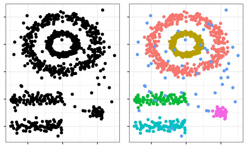
The human brain easily identifies 5 groupings and some isolated observations (noise). Now see the clusters obtained if, for example, K-means clustering is applied.
The clusters generated are far from representing the true groupings. This is because partitioning clustering methods such as k-means, hierarchical, k-medoids, ... are good at finding groupings with spherical or convex shapes that do not contain an excess of outliers or noise, but fail when trying to identify arbitrary shapes. Hence, the only cluster that corresponds to a real group is the yellow one.
DBSCAN avoids this problem following the idea that, for an observation to be part of a cluster, there must be a minimum of neighboring observations within a proximity radius and that clusters are separated by empty or sparsely populated regions.
The DBSCAN algorithm needs two parameters:
Epsilon $(\epsilon)$: radius that defines the neighboring region to an observation, also called $\epsilon$-neighborhood.
Minimum points (min_samples): minimum number of observations within the epsilon region.
Using these two parameters, each observation in the dataset can be classified into one of the following three categories:
Core point: observation that has in its $\epsilon$-neighborhood a number of neighboring observations equal to or greater than min_samples.
Border point: observation that does not satisfy the minimum neighboring observations to be a core point but that belongs to the $\epsilon$-neighborhood of another observation that is a core point.
Noise or outlier: observation that is neither a core point nor a border point.
Finally, using the three previous categories, three levels of connectivity between observations can be defined:
Directly reachable (direct density reachable): an observation $A$ is directly reachable from another observation $B$ if $A$ is part of the $\epsilon$-neighborhood of $B$ and $B$ is a core point. By definition, observations can only be directly reachable from a core point.
Reachable (density reachable): an observation $A$ is reachable from another observation $B$ if there is a sequence of core points that go from $B$ to $A$.
Density connected (density connected): two observations $A$ and $B$ are density connected if there is a core point observation $C$ such that $A$ and $B$ are reachable from $C$.
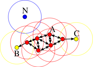
The following image shows the connections existing between a set of observations if $min_samples = 4$ is used. Observation $A$ and the rest of the observations marked in red are core points, since they all contain at least 4 neighboring observations (including themselves) in their $\epsilon$-neighborhood. Since all are reachable from each other, they form a cluster. Observations $B$ and $C$ are not core points but are reachable from $A$ through other core points, therefore, they belong to the same cluster as $A$. Observation $N$ is neither a core point nor directly reachable, so it is considered noise.
Algorithm
For each observation $x_i$ calculate the distance between it and the rest of the observations. If in its $\epsilon$-neighborhood there is a number of observations $\geq min_samples$ mark the observation as core point, otherwise mark it as visited.
For each observation $x_i$ marked as core point, if it has not yet been assigned to any cluster, create a new one and assign it to it. Recursively find all observations density connected to it and assign them to the same cluster.
Iterate the same process for all observations that have not been visited.
Hyperparameters
As is the case with many other statistical techniques, in DBSCAN there is no single and exact way to find the appropriate value of epsilon $(\epsilon)$ and $min_samples$. As a guideline, the following premises can be followed:
$min_samples$: the larger the size of the dataset, the larger the minimum value of neighboring observations should be. In the book Practical Guide to Cluster Analysis in R they recommend never going below 3. If the data contains a high level of noise, increasing $min_samples$ will favor the creation of significant clusters less influenced by outliers.
epsilon: a good way to choose the value of $\epsilon$ is to study the average distances between the $k = min_samples$ nearest observations. By representing these distances as a function of $\epsilon$, the inflection point of the curve is usually an optimal value. If the chosen value of $\epsilon$ is very small, a high proportion of observations will not be assigned to any cluster; conversely, if the value is too large, most observations will be grouped into a single cluster.
Advantages and disadvantages
Advantages
Does not require the user to specify the number of clusters.
Is independent of the shape of the clusters.
Can identify outliers, so the clusters generated are not influenced by them.
Disadvantages
It is a deterministic method as long as the order of the data is the same. Border points that are reachable from more than one cluster can be assigned to one or the other depending on the order in which the data is processed.
Does not generate good results when the density of the groups is very different, since it is not possible to find the parameters $\epsilon$ and min_samples that work for all of them at the same time.
Example
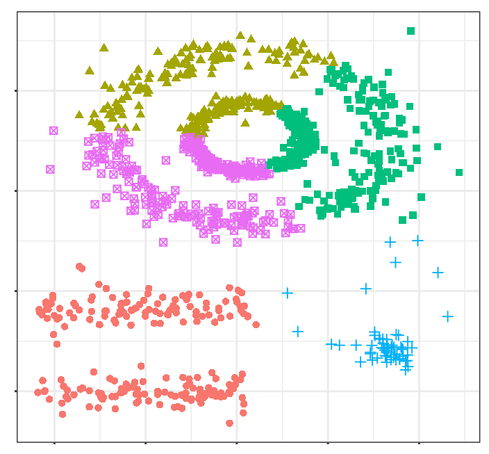
The multishape dataset from the R factoextra package contains observations that belong to 5 different groups along with some noise (outliers). Since the spatial distribution of the groups is not expected to be spherical, the DBSCAN clustering method is applied.
Libraries
The libraries used in this example are:
# Data processing
# ======================================================================
import numpy as np
import pandas as pd
from sklearn.datasets import make_blobs
# Graphics
# ======================================================================
import matplotlib.pyplot as plt
plt.style.use('ggplot')
# Preprocessing and modeling
# ======================================================================
from sklearn.cluster import DBSCAN
from sklearn.preprocessing import StandardScaler
from sklearn.metrics import silhouette_score
# Configuration warnings
# ======================================================================
import warnings
warnings.filterwarnings('once')
Data
url = 'https://raw.githubusercontent.com/JoaquinAmatRodrigo/' \
+ 'Estadistica-machine-learning-python/master/data/multishape.csv'
data = pd.read_csv(url)
data.head()
| x | y | shape | |
|---|---|---|---|
| 0 | -0.803739 | -0.853053 | 1 |
| 1 | 0.852851 | 0.367618 | 1 |
| 2 | 0.927180 | -0.274902 | 1 |
| 3 | -0.752626 | -0.511565 | 1 |
| 4 | 0.706846 | 0.810679 | 1 |
Model
With the sklearn.cluster.DBSCAN class from Scikit-Learn, clustering models can be trained using the DBSCAN algorithm. Among its parameters are:
# Data scaling
# ==============================================================================
X = data.drop(columns='shape').to_numpy()
scaler = StandardScaler().set_output(transform="pandas")
X_scaled = scaler.fit_transform(X)
# Model
# ==============================================================================
dbscan_model = DBSCAN(
eps = 0.2,
min_samples = 5,
metric = 'euclidean',
)
dbscan_model.fit(X=X_scaled)
DBSCAN(eps=0.2)In a Jupyter environment, please rerun this cell to show the HTML representation or trust the notebook.
On GitHub, the HTML representation is unable to render, please try loading this page with nbviewer.org.
Parameters
| eps | 0.2 | |
| min_samples | 5 | |
| metric | 'euclidean' | |
| metric_params | None | |
| algorithm | 'auto' | |
| leaf_size | 30 | |
| p | None | |
| n_jobs | None |
# Classification
# ======================================================================
labels = dbscan_model.labels_
fig, ax = plt.subplots(1, 1, figsize=(4.5, 4.5))
ax.scatter(
x = X[:, 0],
y = X[:, 1],
c = labels,
marker = 'o',
edgecolor = 'black'
)
# Outliers are identified with label -1
ax.scatter(
x = X[labels == -1, 0],
y = X[labels == -1, 1],
c = 'red',
marker = 'o',
edgecolor = 'black',
label = 'outliers'
)
ax.legend()
ax.set_title('Clusterings generated by DBSCAN');

# Number of clusters and "outlier" observations
# ==============================================================================
n_clusters = len(set(labels)) - (1 if -1 in labels else 0)
n_noise = list(labels).count(-1)
print(f'Number of clusters found: {n_clusters}')
print(f'Number of outliers found: {n_noise}')
Number of clusters found: 5 Number of outliers found: 25
Gaussian mixture models (GMMs)
Algorithm
A Gaussian Mixture model is a probabilistic model in which it is considered that observations follow a probabilistic distribution formed by the combination of multiple normal distributions (components). In its application to clustering, it can be understood as a generalization of K-means with which, instead of assigning each observation to a single cluster, a probability distribution of belonging to each one is obtained.
To estimate the parameters that define the distribution function of each cluster (mean and covariance matrix), the Expectation-Maximization (EM) algorithm is used. Once the parameters are learned, the probability that each observation has of belonging to each cluster can be calculated and assigned to the one with the highest probability.
Along with the number of clusters (components), the type of covariance matrix that the clusters can have must be determined. Depending on the type of matrix, the shape of the clusters can be:
tied: all clusters share the same covariance matrix.
diagonal: the dimensions of each cluster along each dimension can be different, but the generated ellipses always remain aligned with the axes, that is, their orientations are limited.
spherical: the dimensions of each cluster are the same in all dimensions. This allows generating clusters of different sizes but all spherical.
full: each cluster can be modeled as an ellipse with any orientation and dimensions.
# Auxiliary function to draw covariance ellipses
# ==============================================================================
from sklearn.mixture import GaussianMixture
from matplotlib.patches import Ellipse
import matplotlib.pyplot as plt
def draw_covariance_ellipses(gmm, ax, n_std=3, **kwargs):
"""
Draw covariance ellipses for a fitted GMM model.
Parameters
----------
gmm : GaussianMixture
Fitted Gaussian mixture model
ax : matplotlib.axes.Axes
Axis on which to draw
n_std : int
Maximum number of standard-deviation ellipses to draw
**kwargs : dict
Additional keyword arguments for Ellipse (color, alpha, etc.)
"""
ax = ax or plt.gca()
colors = plt.cm.Set2(np.linspace(0, 1, n_std))
for n in range(gmm.n_components):
# Select covariance matrix according to the covariance type
if gmm.covariance_type == 'full':
cov = gmm.covariances_[n]
elif gmm.covariance_type == 'tied':
cov = gmm.covariances_
elif gmm.covariance_type == 'diag':
cov = np.diag(gmm.covariances_[n])
elif gmm.covariance_type == 'spherical':
cov = np.eye(gmm.means_.shape[1]) * gmm.covariances_[n]
# Compute ellipse parameters using eigen-decomposition
# (more efficient and numerically stable than SVD for symmetric matrices)
if cov.shape == (2, 2):
eigenvalues, eigenvectors = np.linalg.eigh(cov)
order = eigenvalues.argsort()[::-1]
eigenvalues, eigenvectors = eigenvalues[order], eigenvectors[:, order]
angle = np.degrees(np.arctan2(eigenvectors[1, 0], eigenvectors[0, 0]))
width, height = 2 * np.sqrt(eigenvalues)
else:
angle = 0
width, height = 2 * np.sqrt(cov)
# Draw ellipses for 1σ, 2σ, 3σ
for i, nsig in enumerate(range(1, n_std + 1)):
ellipse = Ellipse(
xy=gmm.means_[n],
width=nsig * width,
height=nsig * height,
angle=angle,
facecolor=colors[i],
edgecolor='darkblue',
linewidth=1.5,
alpha=0.25,
**kwargs
)
ax.add_patch(ellipse)
# Mark the component mean
ax.plot(gmm.means_[n, 0], gmm.means_[n, 1], 'ko', markersize=8,
markerfacecolor='red', markeredgewidth=1.5, zorder=5)
# Visual comparison of covariance types in GMM
# ==============================================================================
fig, axes = plt.subplots(1, 3, figsize=(8, 3.5), sharey=True)
# Generate synthetic data with correlation
rng = np.random.RandomState(5)
X_demo = np.dot(rng.randn(500, 2), rng.randn(2, 2))
covariance_types = ['spherical', 'diag', 'full']
for i, cov_type in enumerate(covariance_types):
# Fit model with a single component
model = GaussianMixture(
n_components = 1,
covariance_type = cov_type,
random_state = 42
).fit(X_demo)
# Plot data
axes[i].scatter(
X_demo[:, 0],
X_demo[:, 1],
alpha = 0.4,
s = 30,
c = 'steelblue',
edgecolor = 'white',
linewidth = 0.5
)
# Draw covariance ellipses
draw_covariance_ellipses(model, axes[i])
# Configure axes
axes[i].set_xlim(-3.5, 3.5)
axes[i].set_ylim(-3.5, 3.5)
axes[i].set_title(f'covariance_type="{cov_type}"', fontsize=10)
axes[i].set_xlabel('Variable 1')
axes[i].grid(True, alpha=0.3)
axes[i].set_aspect('equal')
# Only show ylabel in the first subplot
if i == 0:
axes[i].set_ylabel('Variable 2')
fig.suptitle('Comparison of covariance matrix types in GMM', fontsize=14)
plt.tight_layout()
plt.show()

Example
The following simulated data contain observations that belong to four different groups. The goal is to apply clustering based on a Gaussian mixture model with the objective of identifying the real groupings.
Libraries
The libraries used in this example are:
# Data processing
# ======================================================================
import numpy as np
import pandas as pd
from sklearn.datasets import make_blobs
# Graphics
# ======================================================================
import matplotlib.pyplot as plt
import matplotlib as mpl
from matplotlib.patches import Ellipse
from matplotlib import style
# Preprocessing and modeling
# ======================================================================
from sklearn.mixture import GaussianMixture
from sklearn.preprocessing import StandardScaler
from sklearn.metrics import silhouette_score
# Configuration warnings
# ======================================================================
import warnings
warnings.filterwarnings('once')
Data
# Data simulation
# ==============================================================================
X, y = make_blobs(
n_samples = 300,
n_features = 2,
centers = 4,
cluster_std = 0.60,
shuffle = True,
random_state = 0
)
Model
With the sklearn.mixture.GaussianMixture class from Scikit-Learn, GMM models can be trained using the Expectation-Maximization (EM) algorithm. Among its parameters are:
n_components: number of components (in this case clusters) that form the model.covariance_type: type of covariance matrix ('full' (default), 'tied', 'diag', 'spherical').max_iter: maximum number of allowed iterations.random_state: seed to ensure the reproducibility of results.
# Model
# ==============================================================================
gmm_model = GaussianMixture(n_components=4, covariance_type='full', random_state=123)
gmm_model.fit(X=X)
GaussianMixture(n_components=4, random_state=123)In a Jupyter environment, please rerun this cell to show the HTML representation or trust the notebook.
On GitHub, the HTML representation is unable to render, please try loading this page with nbviewer.org.
Parameters
| n_components | 4 | |
| covariance_type | 'full' | |
| tol | 0.001 | |
| reg_covar | 1e-06 | |
| max_iter | 100 | |
| n_init | 1 | |
| init_params | 'kmeans' | |
| weights_init | None | |
| means_init | None | |
| precisions_init | None | |
| random_state | 123 | |
| warm_start | False | |
| verbose | 0 | |
| verbose_interval | 10 |
The object returned by GaussianMixture contains among other data: the weight of each component (cluster) in the model (weights_), its mean (means_), and covariance matrix (covariances_). The structure of the latter depends on the type of matrix used in the model fitting (covariance_type).
# Mean of each component
# ==============================================================================
gmm_model.means_
array([[ 0.93842466, 4.41564635],
[-1.37355181, 7.75436785],
[ 1.98299679, 0.86735608],
[-1.58913964, 2.82465347]])
# Covariance matrix of each component
# ==============================================================================
gmm_model.covariances_
array([[[ 0.3808649 , -0.02231979],
[-0.02231979, 0.34881473]],
[[ 0.41216925, 0.02884065],
[ 0.02884065, 0.37959193]],
[[ 0.33998651, -0.02620931],
[-0.02620931, 0.34588507]],
[[ 0.32360185, 0.01027908],
[ 0.01027908, 0.30862196]]])
Prediction and classification
Once the GMM model is trained, the probability that each observation has of belonging to each of the components (clusters) can be predicted. Unlike K-means (hard clustering), GMM provides a probabilistic classification (soft clustering), where each observation has a probability of belonging to each cluster. To obtain the final classification (hard assignment), each observation is assigned to the component with the highest probability.
# Probabilities
# ==============================================================================
# Each row is an observation and each column the probability of belonging to
# each of the components.
probabilities = gmm_model.predict_proba(X)
probabilities
array([[2.59296402e-02, 8.04672295e-21, 9.71688955e-01, 2.38140471e-03],
[7.15846263e-09, 9.99999993e-01, 7.13116691e-33, 2.34837535e-15],
[9.99999970e-01, 2.04767765e-08, 8.78022033e-12, 9.13480329e-09],
...,
[9.99965893e-01, 8.75462809e-09, 4.92339895e-10, 3.40976171e-05],
[3.01241053e-06, 9.99996988e-01, 6.44915198e-30, 1.52780115e-18],
[4.39280339e-07, 4.05180546e-15, 1.99754828e-11, 9.99999561e-01]],
shape=(300, 4))
# Classification (assignment to the component with the highest probability)
# ==============================================================================
# Each row is an observation and each column the probability of belonging to
# each of the components.
labels = gmm_model.predict(X)
labels
array([2, 1, 0, 1, 2, 2, 3, 0, 1, 1, 3, 1, 0, 1, 2, 0, 0, 2, 3, 3, 2, 2,
0, 3, 3, 0, 2, 0, 3, 0, 1, 1, 0, 1, 1, 1, 1, 1, 3, 2, 0, 3, 0, 0,
3, 3, 1, 3, 1, 2, 3, 2, 1, 2, 2, 3, 1, 3, 1, 2, 1, 0, 1, 3, 3, 3,
1, 2, 1, 3, 0, 3, 1, 3, 3, 1, 3, 0, 2, 1, 2, 0, 2, 2, 1, 0, 2, 0,
1, 1, 0, 2, 1, 3, 3, 0, 2, 2, 0, 3, 1, 2, 1, 2, 0, 2, 2, 0, 1, 0,
3, 3, 2, 1, 2, 0, 1, 2, 2, 0, 3, 2, 3, 2, 2, 2, 2, 3, 2, 3, 1, 3,
3, 2, 1, 3, 3, 1, 0, 1, 1, 3, 0, 3, 0, 3, 1, 0, 1, 1, 1, 0, 1, 0,
2, 3, 1, 3, 2, 0, 1, 0, 0, 2, 0, 3, 3, 0, 2, 0, 0, 1, 2, 0, 3, 1,
2, 2, 0, 3, 2, 0, 3, 3, 0, 0, 0, 0, 2, 1, 0, 3, 0, 0, 3, 3, 3, 0,
3, 1, 0, 3, 2, 3, 0, 1, 3, 1, 0, 1, 0, 3, 0, 0, 1, 3, 3, 2, 2, 0,
1, 2, 2, 3, 2, 3, 0, 1, 1, 0, 0, 1, 0, 2, 3, 0, 2, 3, 1, 3, 2, 0,
2, 1, 1, 1, 1, 3, 3, 1, 0, 3, 2, 0, 3, 3, 3, 2, 2, 1, 0, 0, 3, 2,
1, 3, 0, 1, 0, 2, 2, 3, 3, 0, 2, 2, 2, 0, 1, 1, 2, 2, 0, 2, 2, 2,
1, 3, 1, 0, 2, 2, 1, 1, 1, 2, 2, 0, 1, 3])
# Visualization of components and GMM model distribution
# ==============================================================================
fig, axs = plt.subplots(1, 2, figsize=(9, 4), constrained_layout=True)
# Left panel: Probability distribution of each component
for i in np.unique(labels):
axs[0].scatter(
X[labels == i, 0],
X[labels == i, 1],
c=plt.rcParams['axes.prop_cycle'].by_key()['color'][i],
marker='o',
edgecolor='black',
label=f"Component {i}",
s=50,
alpha=0.7
)
draw_covariance_ellipses(gmm_model, ax=axs[0], n_std=2)
axs[0].set_title('Probability distribution of each component', fontsize=11)
axs[0].set_xlabel('Feature 1')
axs[0].set_ylabel('Feature 2')
axs[0].legend()
axs[0].grid(True, alpha=0.3)
# Right panel: Probability distribution of the full model
xs = np.linspace(X[:, 0].min(), X[:, 0].max(), 100)
ys = np.linspace(X[:, 1].min(), X[:, 1].max(), 100)
xx, yy = np.meshgrid(xs, ys)
# Compute scores and convert log-probabilities to probabilities
log_scores = gmm_model.score_samples(np.c_[xx.ravel(), yy.ravel()])
scores = np.exp(log_scores)
# Plot points and contours
axs[1].scatter(
X[:, 0],
X[:, 1],
c=labels,
cmap='tab10',
s=20,
alpha=0.6,
edgecolor='k',
linewidth=0.5
)
contours = axs[1].contour(
xx, yy,
scores.reshape(xx.shape),
levels=np.percentile(scores, np.linspace(10, 90, 8)),
colors='blue',
alpha=0.4,
linewidths=1.5
)
axs[1].clabel(contours, inline=True, fontsize=8, fmt='%.2e')
axs[1].set_title('Probability distribution of the full model', fontsize=11)
axs[1].set_xlabel('Feature 1')
axs[1].set_ylabel('Feature 2')
axs[1].grid(True, alpha=0.3)
plt.show()

Number of clusters
Since GMM models are probabilistic models, metrics such as the Akaike information criterion (AIC) or Bayesian information criterion (BIC) can be used to identify how well the observed data fit the created model.
n_components = range(1, 21)
bic_values = []
aic_values = []
for i in n_components:
model = GaussianMixture(n_components=i, covariance_type="full", random_state=123)
model = model.fit(X)
bic_values.append(model.bic(X))
aic_values.append(model.aic(X))
fig, ax = plt.subplots(1, 1, figsize=(6, 3.84))
ax.plot(n_components, bic_values, label='BIC')
ax.plot(n_components, aic_values, label='AIC')
ax.set_title("BIC and AIC values")
ax.set_xlabel("Number of components")
ax.legend();

print(f"Optimal number according to BIC: {range(1, 21)[np.argmin(bic_values)]}")
print(f"Optimal number according to AIC: {range(1, 21)[np.argmin(aic_values)]}")
Optimal number according to BIC: 4 Optimal number according to AIC: 4
Both metrics identify 4 as the optimal number of clusters (components).
Limitations of clustering
Clustering can be a very useful tool for finding groupings in data, especially as their volume increases. However, it is important to remember its limitations or problems that may arise when applying it. Some of them are:
Small decisions can have large consequences: when using clustering methods, decisions must be made that greatly influence the results obtained. There is no single correct answer, so in practice different options are tried.
Scaling and centering of variables
Which distance/similarity measure to use
Number of clusters
Type of linkage used in hierarchical clustering
At what height to establish the cut of a dendrogram
Validation of the obtained clusters: it is not easy to verify the validity of the results since in most scenarios the true grouping is unknown.
Lack of robustness: the K-means-clustering and hierarchical clustering methods obligatorily assign each observation to a group. If there is any outlier in the sample, even though it does not really belong to any group, the algorithm will assign it to one of them causing a significant distortion of the cluster in question. Some alternatives are k-medoids and DBSCAN.
The greedy nature of the hierarchical clustering algorithm means that, if a bad fusion (in agglomerative clustering) or division (in divisive clustering) is made in the initial steps, it cannot be corrected in the following steps, which can lead to suboptimal results.
Session information
import session_info
session_info.show(html=False)
----- matplotlib 3.10.8 numpy 2.2.6 pandas 2.3.3 scipy 1.15.3 session_info v1.0.1 sklearn 1.7.2 statsmodels 0.14.6 ----- IPython 9.8.0 jupyter_client 8.7.0 jupyter_core 5.9.1 ----- Python 3.13.11 | packaged by Anaconda, Inc. | (main, Dec 10 2025, 21:28:48) [GCC 14.3.0] Linux-6.14.0-37-generic-x86_64-with-glibc2.39 ----- Session information updated at 2025-12-29 22:57
Bibliography
Introduction to Machine Learning with Python: A Guide for Data Scientists
Python Data Science Handbook by Jake VanderPlas
Linear Models with R by Julian J.Faraway
An Introduction to Statistical Learning: with Applications in R (Springer Texts in Statistics)
Points of Significance Clustering by Naomi Altman & Martin Krzywinski
Citation instructions
How to cite this document?
If you use this document or any part of it, we appreciate it if you cite it. Thank you very much!
Clustering with Python by Joaquín Amat Rodrigo, available under an Attribution-NonCommercial-ShareAlike 4.0 International (CC BY-NC-SA 4.0 DEED) license at https://cienciadedatos.net/documentos/py20-clustering-with-python.html
Did you like the article? Your help is important
Your contribution will help me continue generating free divulgative content. Thank you so much! 😊


This document by Joaquín Amat Rodrigo is licensed under Attribution-NonCommercial-ShareAlike 4.0 International.
You are free to:
-
Share: copy and redistribute the material in any medium or format.
-
Adapt: remix, transform, and build upon the material.
Under the following terms:
-
Attribution: You must give appropriate credit (appropriate credit), provide a link to the license, and indicate if changes were made. You may do so in any reasonable manner, but not in a way that suggests the licensor endorses you or your use.
-
NonCommercial: You may not use the material for commercial purposes.
-
ShareAlike: If you remix, transform, or build upon the material, you must distribute your contributions under the same license as the original.